


Notify me
Diamonds ain’t a small thing. Well, sure, it can be – in a physical term – but often the connection to them, or the story that leads up to the purchase of one, is strongly linked to an important decision, memory or emotion.
When the fine jewelry brand Norrfolks came to Nineties with a need of revival, we knew that the result of our work hopefully would become a part of people’s greatest moments in life. That ain’t such a small thing either, at least for us.
Norrfolks needed a way to stand out of the crowd. When we began our thorough research, we immediately noticed that the engagement and wedding section of the jewelry business is mainly two things: 1, conservative. And 2, traditional.
Since Norrfolks in its core was focused on quality, equality and a responsible mindset (with their lab grown diamonds, to say one thing) we realized that we could take this one step further. Being progressive was simply in their core, but without showing it. Here, we found our mission – to make the progression of the brand transform from facts into feelings. By doing so, Norrfolks would take a huge step in becoming distinguished from their competitors, attract new conscious customers and their product would finally align with their brand position.
With this insight, we started working on the new visual narrative and identity of Norrfolks. We landed on a balance of edgy yet graceful, with a homage to Swedish nature through Scandinavian minimalism. A new take on their own heritage. The symbol, that goes through the entire brand both on its own and as a print, got visualized in 3D – a communication that is not common within traditional jewelry.
The visual narrative got translated into packaging, and we at Nineties wanted to rethink how one presents and keeps their jewelry. We wanted to step away from the classic velvet boxes but still keep the elegance and luxury of a diamond piece. To make the rings stand out and make their best appearance to the wearer, we put lots of effort in customizing the inlays of the packaging. Our vision was that the Norrfolks box would be something you leave on the table to be shown, and not tucked away next to other, regular jewelry boxes.
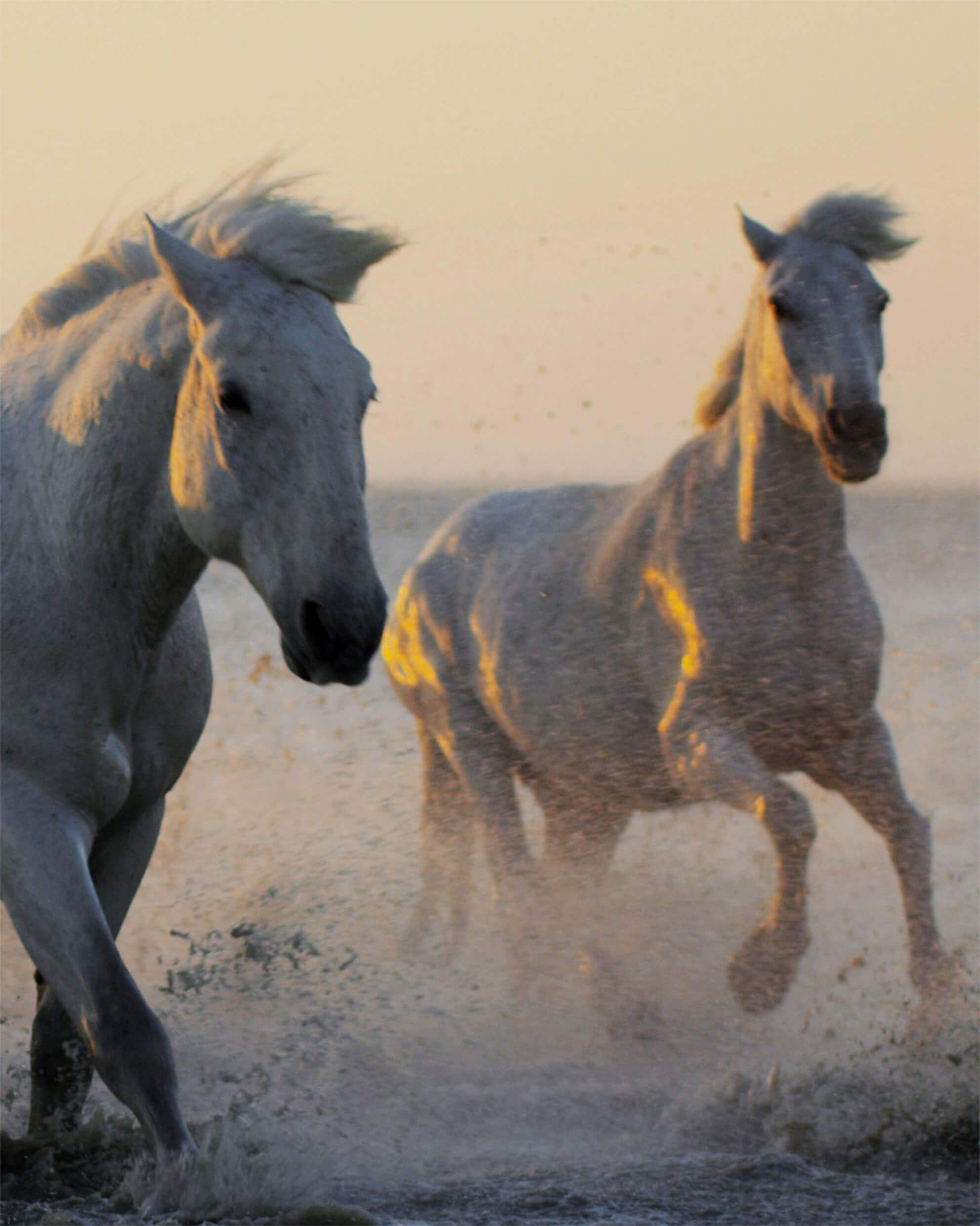
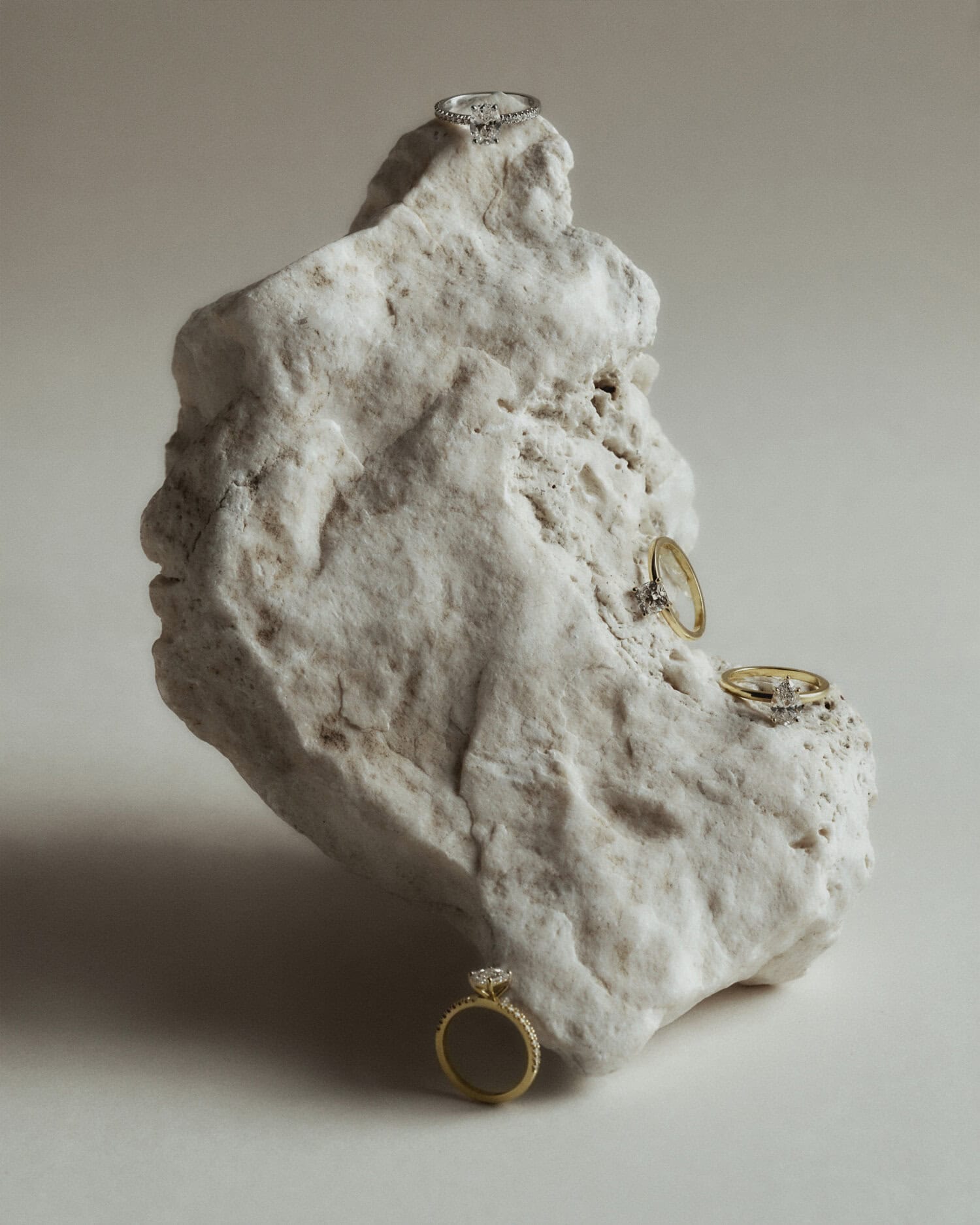
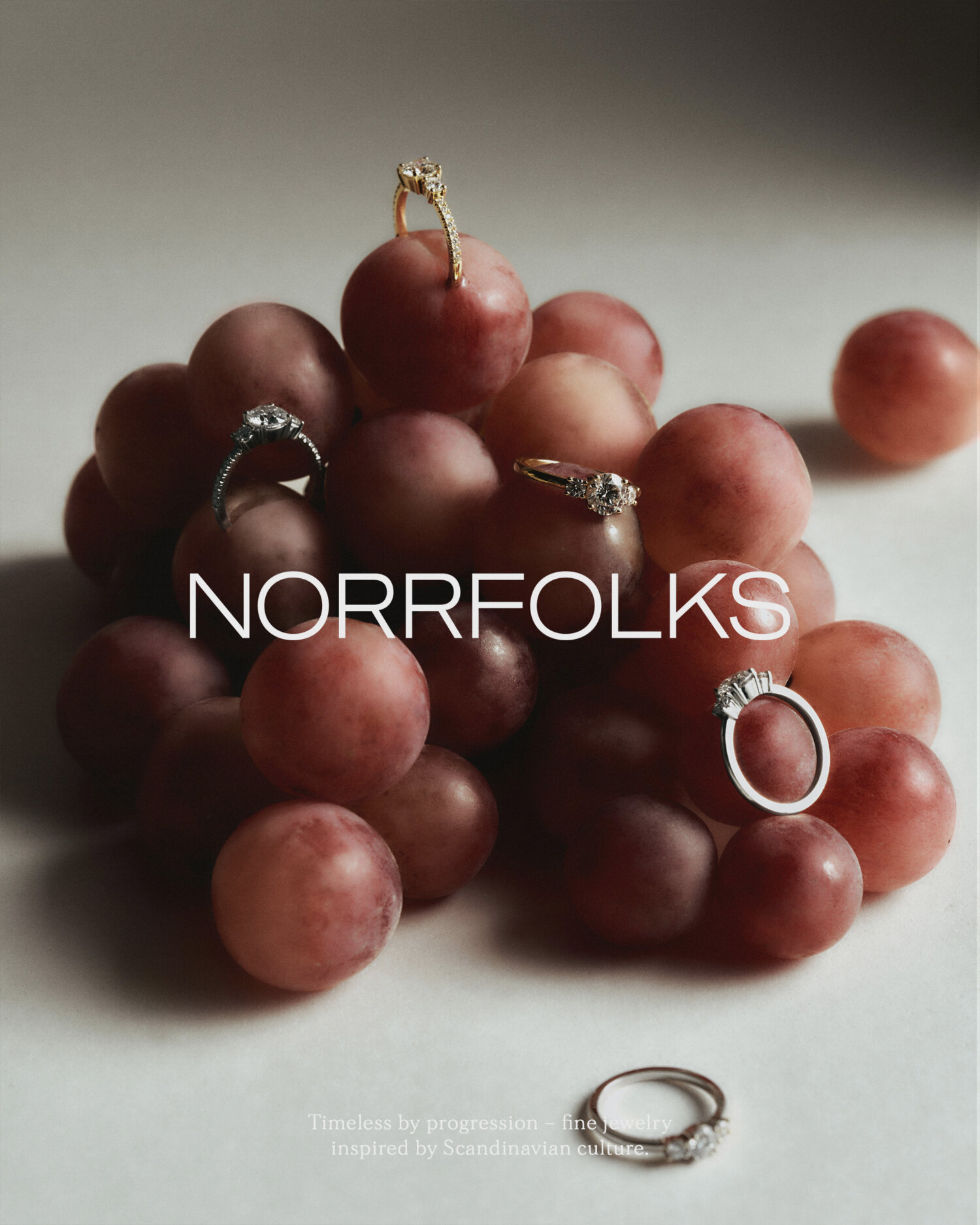
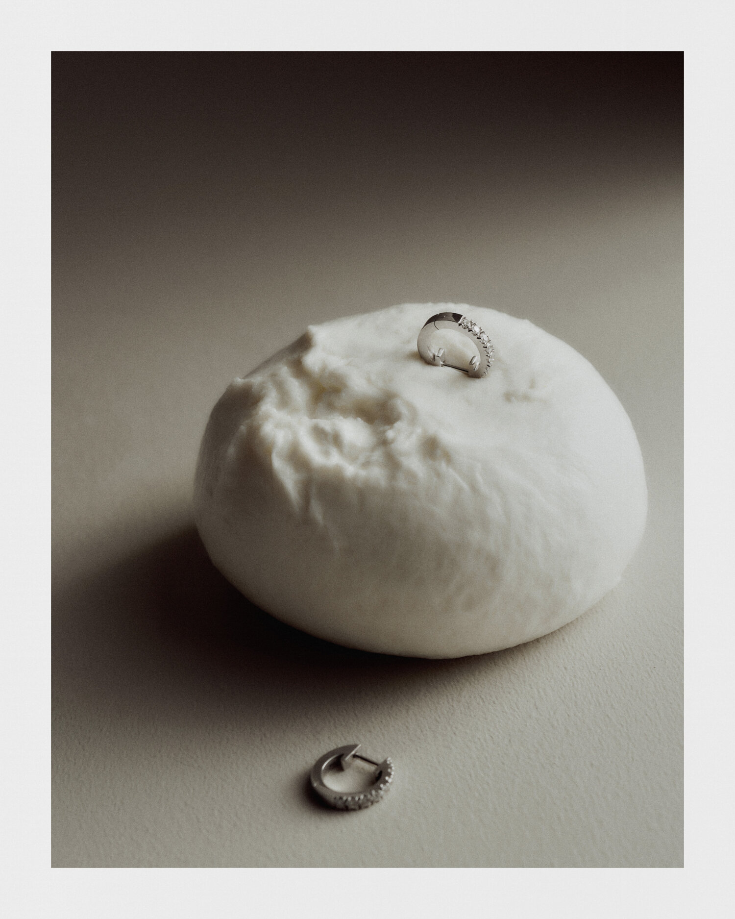
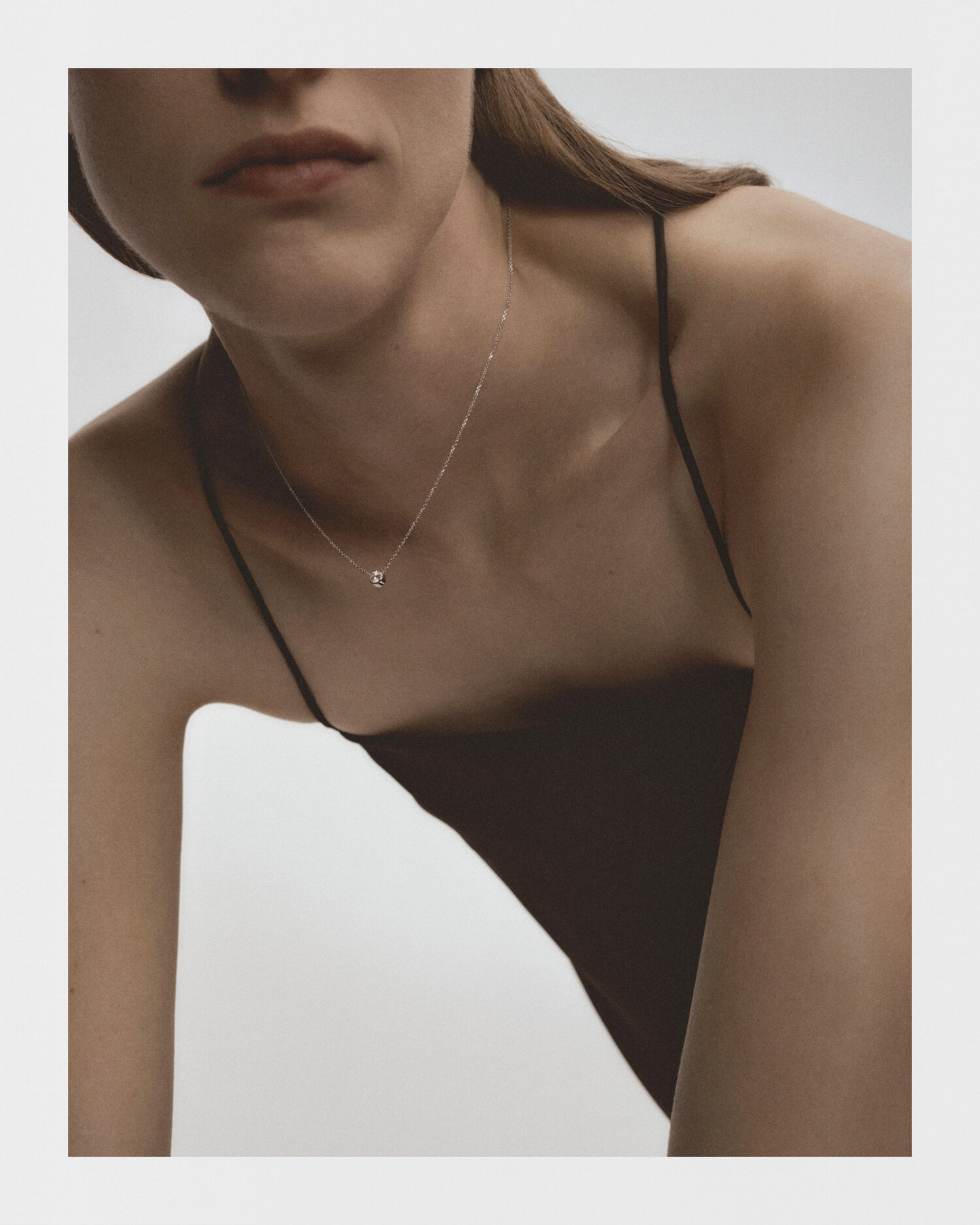
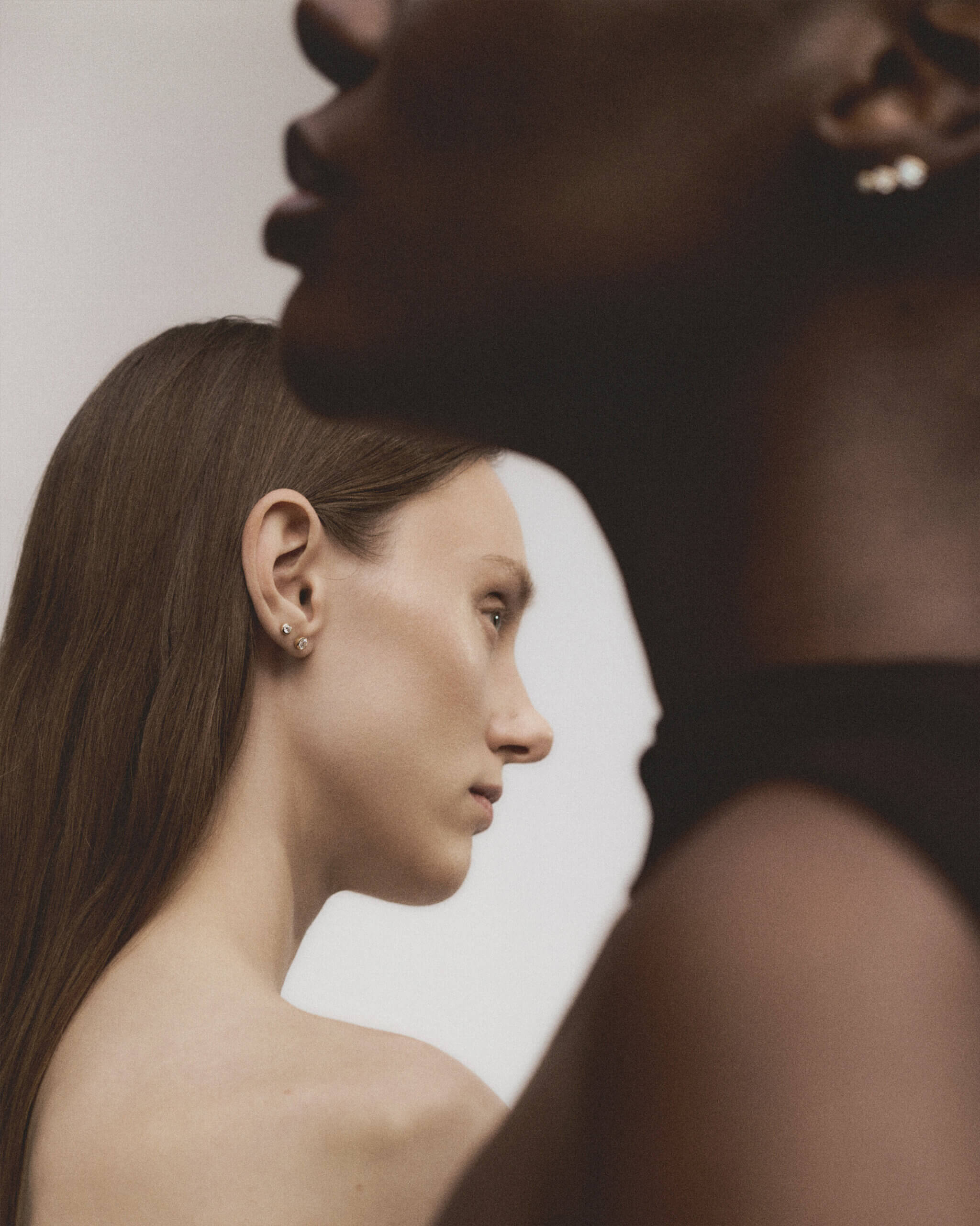
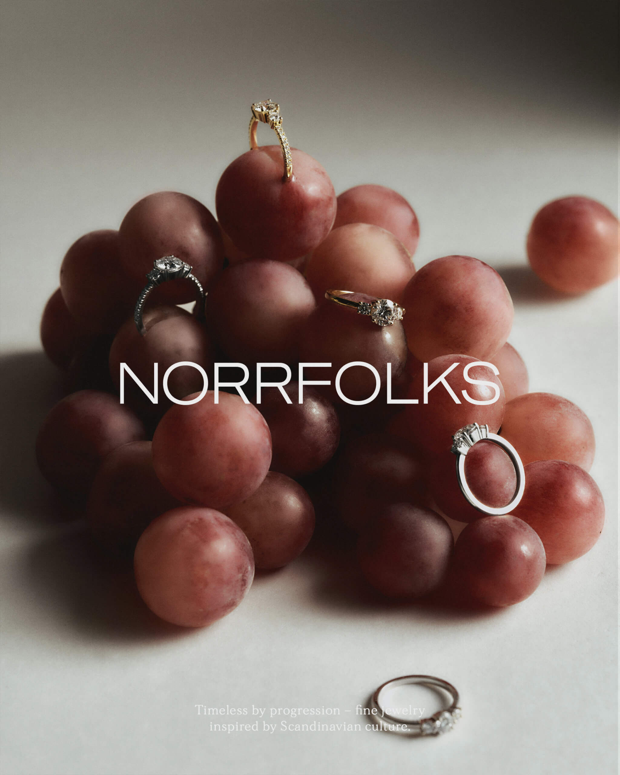
To visualize the new narrative further, we produced imagery: product images, still life and wearing. Our goal was that each shot would be strong enough to work as campaign material. By daring to be imperfect in our imagery we differentiate Norrfolks from the traditional way to portrait fine jewelry.
To reach the customers, Norrfolks required an updated E-commerce and UX-design. To achieve the same feeling as their new visual narrative, we wanted the page to be minimalistic – not just in its design, but also when it comes to functionality. Everything the customer might need should be visible, yet in a simple way. E-commerce can be quite complicated – we made it look the exact opposite.
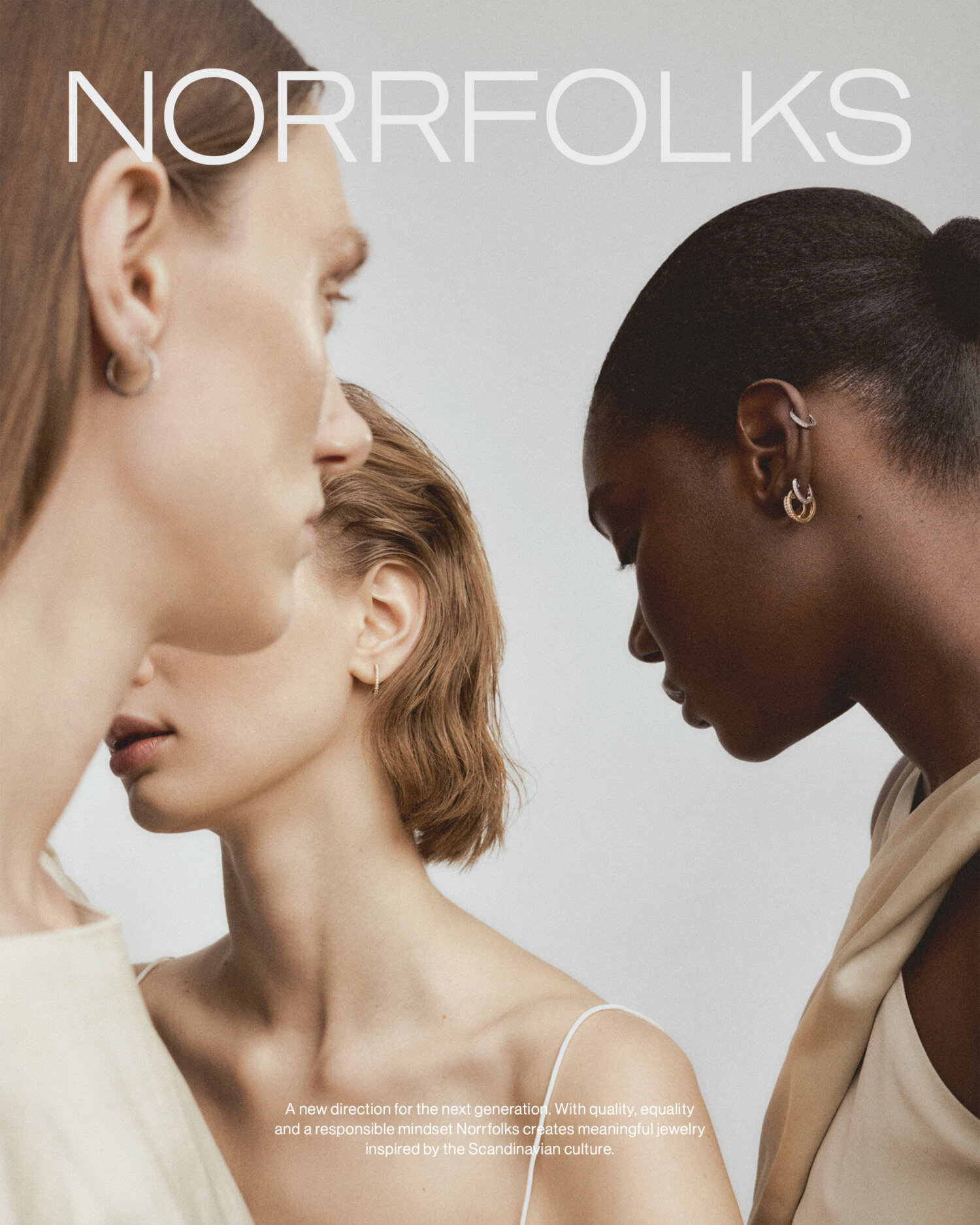
Norrfolks / Timeless by progression
Campaign for Norrfolks fine jewelry collection.
Norrfolks / Art and creative direction
Production still life campaign for fine jewelry brand Norrfolks.